Letterforms
Medieval scribes seldom bothered to record when and where they copied a given manuscript. Modern scholars must often rely on paleography–the study of handwriting–to determine a manuscript’s age and its place of origin. The key to this determination is an awareness of regional variations in handwriting and the changes that took place in the script of a given region over time. Paleographers have established the basic historical characteristics of medieval handwriting by carefully examining the few dated and localized examples available.
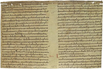
9th Century
The graceful script in this fragment (which was recovered from the binding of a book) is an example of handwriting that was developed during the Carolingian Renaissance. It is identified by paleographers as "Caroline minuscule," since it was fostered during the time of Charlemagne (Carolus Magnus in Latin) and because it used letters that were smaller (minus) than the exclusively capital letters employed by the ancient Romans. We call these letters "lower case" because printers used to keep the type for minuscule characters in a lower case and the type for capital letters in an upper case. Modern print, in fact, is ultimately based on the revolutionary form given to the Roman alphabet during the time of Charlemagne. Minute details enable us to identify Tours as this manuscript’s place of origin.
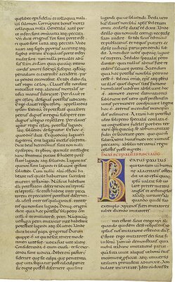
11th Century
This script demonstrates the evolution of Caroline minuscule in the direction of the Gothic form that was to dominate bookhands during the High Middle Ages (13th-16th centuries); thus it is sometimes called "Protogothic." In this transition, scribes began to separate words more clearly, replaced the ae-diphthong with the æ-ligature or the letter e with a cedilla (which stood for the letter a), kept the foot of the tall letter s on rather than below the line, wrote the letter d with a stem curved to the left rather than a vertical stem, and made more use of abbreviations.
Purchased in 1888 for A. D. White.
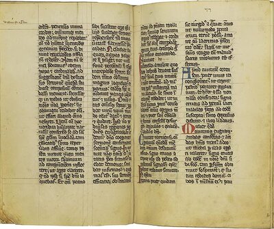
13th Century
In this example the characteristics of Gothic minuscule are fully developed, including angular serifs, forked stems (see especially the letters b, h, and l), the preference for the letter d with a stem angled to the left rather than a vertical stem, and the use of a 7-like sign to indicate an ampersand. Scribes held the pen at an angle of about 45° in order to exploit the shading (that is, the variation in thickness of a penstroke) offered by a quill nib. Another characteristic of Gothic manuscripts is the abundant use of abbreviations, which enabled scribes to copy texts faster and to save parchment. Gothic manuscripts also tend to display prominent ruling drawn in lead or brownish "crayon." In contrast, the examples of Caroline and Protogothic minuscule have nearly-invisible ruling achieved with a stylus, a sharp implement used to scratch grooves into the parchment. On the whole, Gothic minuscule looks bolder, denser, and more elaborate than the scripts that preceded it. This distinct Gothic script was not, however, the result of a deliberate break with the past; it represents the cumulative effect of slight changes that emerged one by one over the course of centuries.
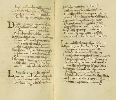
15th Century
Localizing the text in this example is easy, because it is written in the Tuscan vernacular. Petrarch, known as the Father of the Italian Renaissance, reacted strongly against the "dark age" that followed the fall of Rome. He regarded its culture as decadent, and disparaged its script as the legacy of the Germanic barbarians who destroyed classical civilization. The humanists who followed Petrarch’s example likewise rejected the affected quality of Gothic bookhands; in striving for a more natural style, they imitated the exemplars of late Caroline minuscule. In doing so, they mistakenly believed they were imitating the script that the ancient Romans themselves had employed. Instead, they were actually using an improvement devised by the very culture they disdained.


